TL:DR
Yes you can use CSS Grid in IE 10 and 11, it’s just a different version so the syntax is a bit different. On the plus side though, it doesn’t interfere with your current CSS Grid setup. :-)
Background
Did you know that a Grid system was originally developed for Internet Explorer 10 (IE10) back in 2011? It was submitted to the W3C and, while a great start, it was not complete. They worked on it some more to develop the CSS Grid system we use today. So there are some similarities between the two, but the IE one is set up in a different way in parallel. Read more about the whole story here.
So What is it Good For?
It’s not good for all scenarios so I will be going through two examples. One is where I am using CSS Grid and IE Grid would be a good fallback. The other where it would not be a good fallback so I used Flexbox as the IE11 fallback instead as flexbox works fine in IE provided you do all the prefixes (the code examples assume you are using an autoprefixer).
IE Grid vs CSS Grid
Pros: - Good for small layouts - Can keep the HTML and other CSS the same - Prefixes keep it seperate so no interference
Cons: - No auto allocate so have to allocate manually - No grid gap have to have empty rows/cols instead - Prefixes are sufficiently different to make auto prefixing difficult; you have to do it by hand or have an extra one check it out first.
IE Grid Example
The scenario where I would use a native IE grid fallback is where there is a very small grid, say if you have a header, main content area and a sidebar. This would be implemented using two columns and two rows.

Two Column Two Row Example with Header
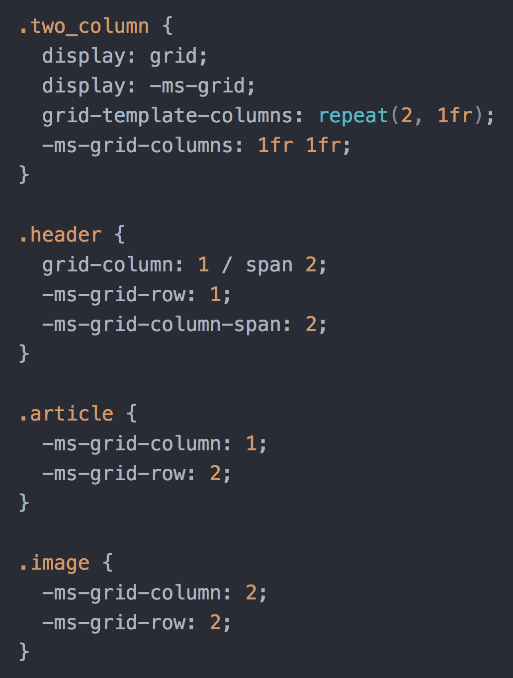
The header will span the whole first row and then the rest of the content is to be split between the two columns. Here is how I would write this up using just CSS grid:

CSS Grid Code
In this set up there are only three elements here so we can add in the IE Grid version as well. They all have -ms- prefixes so they won’t interfere with any other browsers, starting with -ms-grid-. As the property names are slightly different, it isn’t a straight conversion. One particular challenge is getting an element to span over multiple columns, you’ll need to add in a new property -ms-grid-column-span to say how many columns you want the element to go across.
The next gotcha: If you add the -ms-grid- to the start but forget to specify which elements go where, it will put them all the top left corner at row 1, column 1. This can be a bit baffling when you are just starting out. ;-)

Overlapping Content on IE11
Each element also will need the grid column and row number allocated (you can skip some, I’ve included them all here just to illustrate).
- Top left: row 1, column 1 (
.header) - Top right: row 1 column 2 (
.header) - Bottom left: row 2 column 1 (
.article) - Bottom right: row 2 column 2 (
.image)
Two Column and Two Row with ie Grid
It’s also why I would hesitate before using this approach in an example with many rows and columns: you might need to find every element and give it a specific row and column value, as well as having to update it every time a new element is added. However, for large blocks of content which falls into a fairly simple layout, it works quite well.
The last gotcha here is there is no grid-gap in IE grid. So, if you want your columns to be separated, there are two ways to do it. One is to add some padding or margin, like you do without grid. The other way is to add empty rows and/or columns that will act as the gap. Here is the code that would need to be added/modified to add a gap of 30px between the columns:

IE Pseudo Grid Gap
In this example the content that was in column number 2 before has now been moved to column number 3 as 2 is now the empty gap in-between.
IE Grid vs Flexbox Fallback
Flexbox works (mostly) the same in IE as it does in modern browsers, provided you use the prefixes. If you are using a combination of flex box and grid, though, there are a few extra bits and pieces you’ll have to do to make it work in both. If you need to support IE and can do it in flex maybe just stick to flex for now.
Pros: - Good for large grid layouts as will be less code than IE Grid as the placement is automatic - Compatible with auto prefixers so you don’t have to manually prefix
Cons: - Extra divs with widths and margins set explicitly, so more HTML and CSS - The CSS has to be set out separately to prevent it from interfering - No grid gap so have to manage with widths and margins
Flexbox Fallback Example
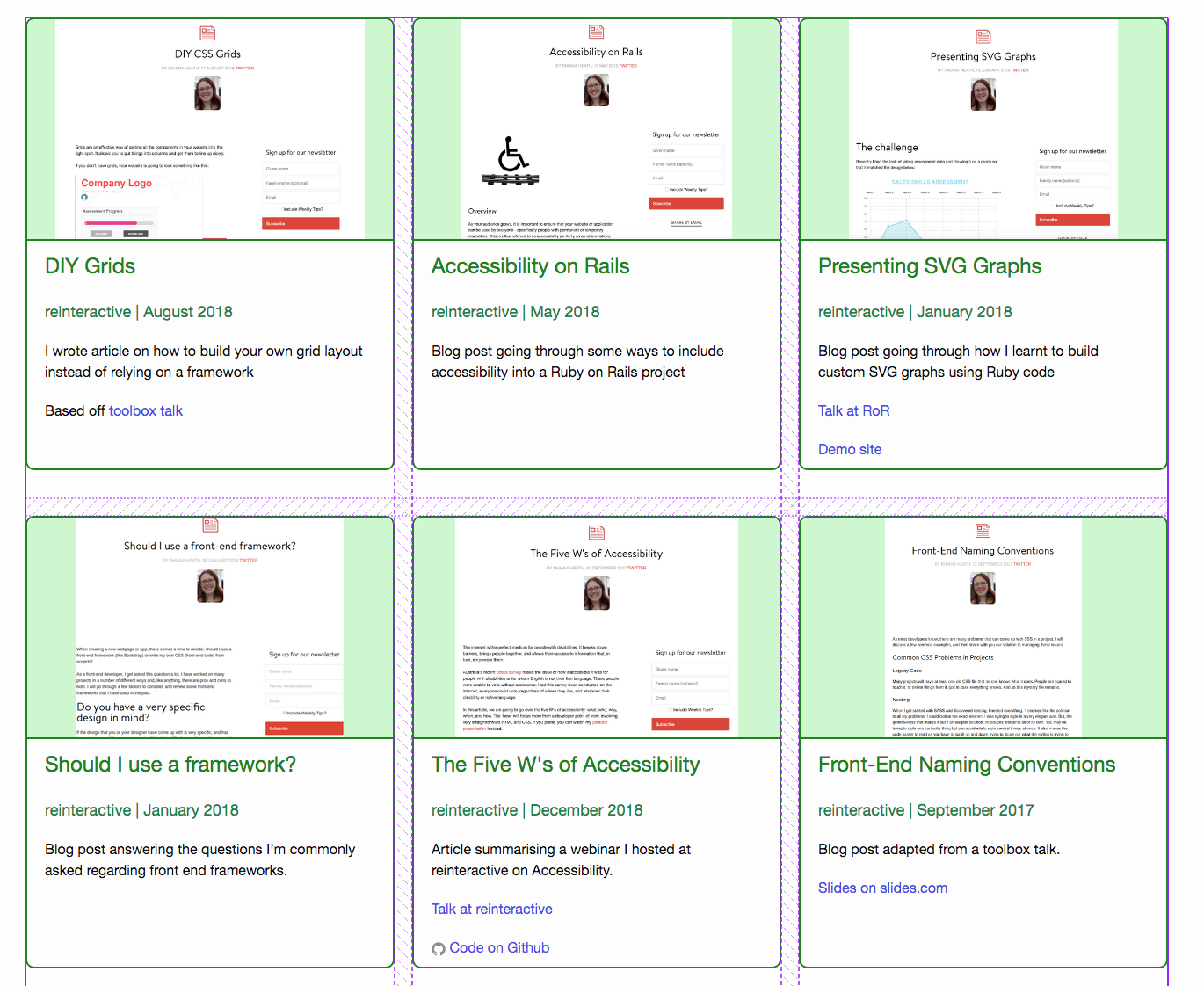
The scenario where it is quicker and less code to put in a flex fallback rather then use IE grid is where you have a lot of child elements that you don’t want to have to specifically lay out. For example a list of blog posts:

Blog Post List Example
This kind of layout could have dozens of entries and is not something you want to manually assign to each one, so flex is a good fallback here. It won’t look as precise as the grid version but is preferable to them turning into a single column.

Grid Only Code
From here we can wrap the grid code into a supports wrapper (I’m using SCSS syntax here FYI) so it will only run if the browser can process grid code (not IE). Then we place the flex code above it. This utilises the cascading nature of CSS where the flex code will be overridden by the grid code if the browser supports grid (all modern browsers, including Edge).
This will need to be done with the width of each child element also. The grid will want each child to be full width whereas the flex code will want them to be a specific width for how wide the columns should be. In this case there are three columns, so I put the width to 32% with some room for margins:

Grid with Flex Box Fallback Code
Where Do I Go From Here?
I’ve covered a couple of examples here to get you started. These cover the two main types of layouts that I personally encounter day to day. For a more in-depth series I recommend reading CSS Grid in IE: Debunking Common IE Grid Misconceptions.
It goes over some more conversions and examples from CSS grid to IE Grid and includes details on how to get it running with a prefixer.