Grids are an effective way of getting all the components in your website into the right spot. It allows you to put things into columns and get them to line up nicely.
If you don’t have grids, your website is going to look something like this:
 Everything is in one column with varying widths and generally looks disorganised.
How Do I Even Grid?
There are a few options:
- Framework
- DIY
- Get a front-end dev to do it for you
There are many frameworks out there that use grid, such as Bootstrap and Foundation. People have even been known to install a framework purely for the grid capability! However, you have to battle with the framework to get your own styling in it and to get the grid exactly how you want it. There are both advantages and disadvantages to frameworks which are detailed below:

While these are all fairly self-explanatory, I will give you an example of how divs and classes can quickly get out of control in code snippet below. This is nothing more than a top header that contains a logo and a couple of links. It shouldn’t be this complicated!

I personally advocate doing it yourself as opposed to a framework. In this article, I will show some examples on how you can get a header up with a lot less code than this.
Grid Tools
Grid tools can seem a bit ‘magic’ and a little intimidating, even for an experienced front-end developer. But once you break it down and learn the nuances, they will make your websites look great with a whole lot less code. I will cover the following three options: - CSS Grid - Flexbox - Columns The main ones I use are CSS Grid and Flexbox but I will also cover Columns for completeness.
CSS Grid
Can I use CSS Grid?
Whenever I see something new and shiny in CSS, I go to the Can I Use? site. The support for CSS Grid is gaining and is almost up to 90%. The only one that doesn’t have full support is IE. The less said about that, the better. :-)
 I started using CSS Grid earlier this year. A lot of the examples I came across were extremely complicated and intended to showcase all the amazing things that CSS Grid can do. But, mostly I just wanted to use it to get a header looking right or line up a couple of columns. In this post I will show you how to get started with the basics and leave the fancy stuff for later.
What is CSS Grid good for?
Features include: - Very precise layout: you can put things exactly where you want them. - No extra divs! You don’t have to put divs around things just for layout. - One line responsiveness
As an aside, you can visit the CSS Grid Garden Game as a way to learn some of the terminology.
The image below is the same website shown above but this time using the grid system.

The dotted lines there are the grid lines. The top section has three columns, the next section has two columns and the bottom section has three columns.
If you are using grid, I recommend using Firefox. It gives you line numbers and grid lines and all the information about what your grid is doing making it easier to debug.
This is our navbar:

What I’ve done here is three columns. the first one is empty, the next one has a logo in it, and the last one has a nav in it. For our header, I’ve begun with display: grid; which tells CSS we are going to make this into a grid.
Next we use grid-template-columns: repeat(3, 33%); to say that we want three columns, each taking up 33% of the available width. Grid supports whatever unit of measurement you wish to use: pixels or ems or percentages, it doesn’t really matter. You can use whatever combination you like.
grid-template-areas: "empty logo nav"; is a useful feature that allows you to name your columns. In this example I have named my three columns empty, logo and nav. Firefox puts the labels on the grids which makes it easier to work with. Then I can go into my logo class and specify what should go where.
Putting these things into practice, we can simplify the html for the site above:

We’ve got a header, a logo, and a nav complete with links. As you can see, using grid removes all the excess divs and allows you to place items wherever you like on the page. The empty column is a grid feature I have found to be particularly useful and I don’t have to use margins.
The next example is a two column layout:

Again we begin with display: grid;.
We use repeat in a different way here to customise our column layout. Here we use a new unit for grid, 1fr, which is for fraction. (2, 1fr) divides the column into two equal parts (i.e. 50% each). Similarly (5, 1fr) would divide the column into five equal parts, or 20% each.
grid-gap: 5px; places a 5 pixel gap between columns, instead of having to use a margin
Responsiveness
To make your layout responsive, you can use @include mobile
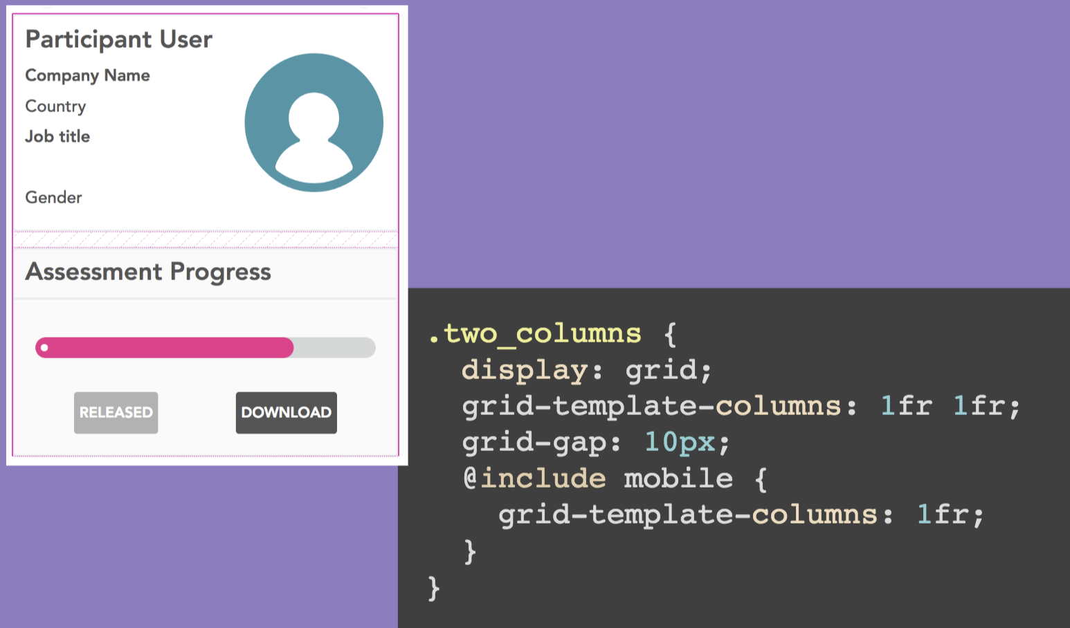
In this example, we are specifying that, on mobile, we will have one column instead of two columns. This is a quick and easy way to make your app mobile-friendly.
As an aside, this is using a CSS mobile mixin. I use it absolutely everywhere and it is a great helper mixin for inline mobile styling.

You can even take these mixins one step further and set up your own reusable grid code, with the mobile styling already included. It is kind of like building your own framework you can set up snippets of grid code that you find yourself repeating everywhere to make your code DRY’er.

So in this example we’re parsing a variable cols into the mix-in which will be the number of columns we want. This will be put into the grid code and will make that many columns of equal width which then fallback to one column on a mobile device. You can then add any grid-gap or grid-template-areas that then apply to that particular section.

In this example, we have three columns. The 20%, 60%, 20% is how much of the page each column will occupy.
One line responsiveness (warning: advanced technique)

This is one line of responsiveness: repeat(auto-fit, minmax(350px, 1fr)). It specifies that the minimum width it can be is 350 pixels and if it gets less than that, change the number of columns.
The gotcha with this is when you have a very large screen. It will keep adding more and more columns (even empty columns if there is no content!) so be sure to check your page in both directions.
This is a good solution if you have lots of little things on your screen, but it is best reserved for advance developers as it can break your layout.
Flexbox
Can I use Flexbox?
As we can see from the Can I Use? site, Flexbox has been around a lot longer than grid so it has a lot more support (97%).
 It has a lot of prefixes, many many more than grid. It can get confusing but you can use a ruby gem (or other pre-processor for your environment) to get around this. Add the following line to your
 Gemfile:
ruby
gem autoprefixer-rails
Using this gem will also get you a lot more browser support for free.
What is Flexbox good for?
Features include: - Better browser support - Vertical centering
I use Flexbox when I need better browser support than is offered by Grid. I also use it for vertical centering because Grid isn’t great at vertical centering.
Be sure to check out the flexbox froggy game, which is created by the same people who created the CSS Garden Grid. It’s a really cute and fun way to get your head around the syntax.
This is the design we’re going to look at now - it is a basic login screen with the login box right in the middle of the screen:

This is the code of how you would do it in Flexbox:

It is fantastic at centering things!
align-items is vertical
justify-content is horizontal
min-height: 100vh; vh means ‘vertical height’
How simple is that?
Aligning
It is also great for aligning navbar items in the centre.

align-items does also work in Grid FYI
Mobile View?

For mobile views, I use flex-directions. By default the Flexbox direction is rows, for mobile I simply switch it to column. Occasionally you might need to add some extra margin as well.
There are a few other gotchas with Flexbox, unlike Grid that is very precise where you can say you want something to be exactly 20% wide or 350 pixels, Flex sometimes wraps things around or moves things into odd places or squishes things together. You might need to play around with other properties like flexwrap to get around it. It can be a little temperamental.
I tend to use CSS Grid for the bigger layouts and flex for centering.
Columns
Can I Use Columns?
Again, referring to the Can I Use? site, we can see that Columns has 97% browser support.

Having said that though, I don’t use columns all that much. You can’t get a very precise layout using columns.
What is Columns good for?
Features include:
- Masonry layout
- No white gaps
Easily the most useful thing Columns are good for is a masonry layout. The image below is an example of this type of display:

This is a masonry layout using Columns and there is no Javascript here at all!

The syntax is quite simple although there are a number of prefixes so definitely use the prefixer gem here as well.
column-count: '3' means there are three columns
column-gap: 40px; puts a 40 pixel gap in between the columns
If you want something precise, don’t use this because it tends to flow top to bottom and left to write and can seem to be a bit random as to where it will put things.
As an example of how great it is at masonry layouts, here is the same page above done in Grid:

It looks awful! And even more awful using Flexbox:

But the client needs it to work in IE!
As much as we would all like to pretend IE doesn’t matter, most client require their website to work in IE. Grid doesn’t really work very well in IE so you have to put in some fallback layout code. There are a couple of ways to do this. Mix-ins are the obvious way which I have detailed above.
There is a feature called supports. You can put @supports (display: grid;) and this says ‘If this browser can use grid, then use grid. Otherwise you can put some other layout code there for it to use instead.
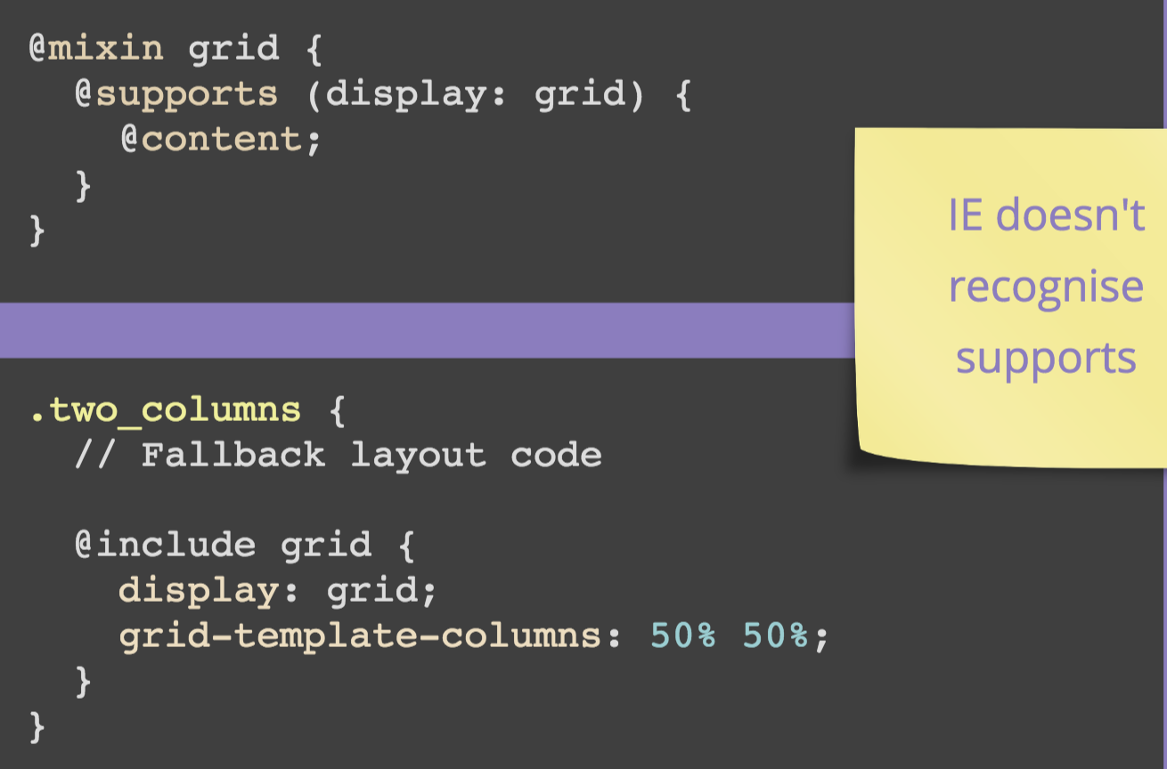
Just a note: IE doesn’t know what supports is which is why I had to do it in this order rather than the more logical reverse order.
Another way you can do it is to create a media query to select just for IE (taken from browserhacks):

Here, you can simply put all your IE-specific code in the @include ie section.
Conclusion
I hope this has given you an overview of each of the three DIY grid options and what use cases they are best suited for. I recommend starting with the basic syntax I have covered here and saving the more complex techniques until after you have mastered the basics. Good luck!