
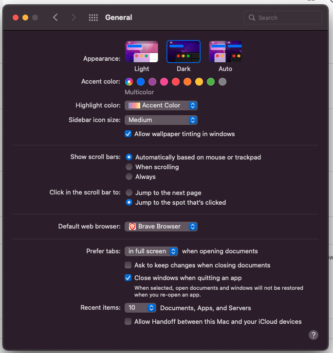
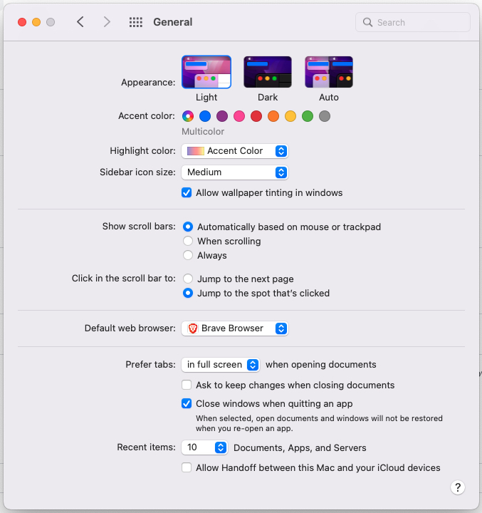
Deciding what theme to use in your user interface design can be tricky. The dark user interface (UI) theme has become a new trend and is designed to display dark backgrounds across the majority of the UI, whereas light UI is generally a theme that displays light backgrounds
Apparently, there cannot be a hard and fast decision in concluding which could be perfect for our application. It depends on many factors to choose between Dark UI or Light UI which includes:
- User choice
- User environment
- Emphasis area
My personal choice would be to use the light theme in an application because the UI looks much cleaner and attractive.
What Is Dark UI?
Basically, Dark UI can be defined as creating the look and feel of the app with mostly dark backgrounds and an absence of light. Dark UI displays light text on a dark-grey background and aims to reduce dazzling light at which may be easier for our eyes too. It is also known as “negative contrast polarity”.
Characteristics:
Colour
Background colour is the foremost thing that comes to everyone’s mind when talking about dark UI. It does not have to be black, but it’s better to consider a wide range of shades: from dark blue to grey.
Contrast
One of the challenges in designing dark themes is achieving a favourable colour contrast as saturated colours which look great on a light surface can visually shake in dark UI, making it harder to read and causing eye strain. So, using a lighter tone in dark UI increases the readability, helping to maintain proper contrast without causing eye strain.
Negative Space
Skilful use of negative space is one of the most fundamental elements of successful dark UI design. Negative space also known as ‘White Space’, if used wisely it will make the dark UI more readable and make it easier for people to grasp the information.
Commonly used places of Dark UI
First of all, it depends upon the user’s choice which UI mode they prefer the most. Generally, a number of apps consist of both modes where the user selects it according to the time and place:
- App settings
- Music distribution web apps
- Banking apps
- ECG monitors
- Ultrasound monitors
- Image editors
What is Light UI?
Light UI can be defined as creating a look that emphasises dark text over a light background i.e white background. For people with normal vision, the content of any text is better perceived in a lighter mode. It is also known as “positive contrast polarity”.
Characteristics:
Colour
Positive contrast polarity can be described as the contrast between text and background. Light UI is a design mode that refers to dark text over the light background.
Contrast
Light UIs tend to have high contrast between text and background to ensure readability.
Commonly used places of Light UI
- App Settings
- Apps containing a lot of text to improve the readability
- Apps that needs to play with brand colours
- When the apps are mostly likely to be used in daytime
- Gaming
Dark UI vs Light UI
Advantages of Dark UI
- Improves readability in low-light conditions.
- It can save battery power, especially for devices with OLED or AMOLED screens, where black pixels are turned off completely.
- Reduces eye strain.
- The core element of the page stands out and gains prominence.
Disadvantages of Dark UI
- It can cause some issues with readability and accessibility, especially for people with low vision, colour blindness, or astigmatism.
- It can also make some content less visible or attractive, such as images, videos, or charts.
- For developers, it requires more time and effort to design and test dark UI to see if all elements stand out correctly.
Advantages of Light UI
- Light UI improves concentration, hence makes it easier to read for the pages with lengthy texts.
- Using Light mode experiences quick judgment time.
- Light themes are commonly associated with professionalism, cleanliness, and simplicity.
- More natural reading experience can be gained from Light UI.
Disadvantages of Light UI
- A light theme can cause eye strain and fatigue for visitors who spend long periods of time on your website.
- Light themes can sometimes be seen as boring or too basic, which is not ideal if you want to stand out.
- Light themes can be too bright and overwhelming for visitors, if they are viewing your site on a bright screen
How to Design an Effective Dark Mode UI
Avoid Pure Colours
Pure colour refers to a colour without any mix of grey in it. For example, white and black. It is generally believed that placing pure white text in a pure black background is Dark UI. But, if the contrast is too high it causes eye strain which will negatively affect the experience.
Avoid Pure White Text
Pure White Text is never recommended to be used in dark mode. Despite causing eye strain, it might also appear blurry in most of the screens.
Leverage Negative Space
An important concept while playing with dark mode UI is using the negative space effectively. A dark theme can look to be overloaded if the elements are not kept together. A well experienced developer will try to use white space fully .
Be Careful of Colour Saturation
Various elements need to be considered while working with dark UI. High contrast colours doesn’t normally go with dark backgrounds, they make it harder to read the text. It might be too vibrant and irritate the users. So, we must avoid fluorescent colours while designing dark UI.
Seek to Preserve Your Brand Identity
Creating the brand identity is an extremely long process and years of hard work for any company. So we must keep in mind to protect the brand’s identity even if in a dark mode UI. Although, it’s said that dark mode UI doesn’t look good with high contrast colours, the original brand colours in the logos must be preserved.
Give Users a Choice
When using dark mode, allow users to switch between dark and light mode. On some sites, there is even the option to choose when to switch to dark mode at certain times. However, the best option is to let users switch between modes on their own.
How to design dark mode UI? Find out more here
Contact Reinteractive Today To Design Your Perfect UI
The choice between a Dark UI and a Light UI can greatly impact the user experience. Reinteractive will help you design the best UI for your application and objectives.
Contact us for schedule your free UI consultation here