
The Challenge
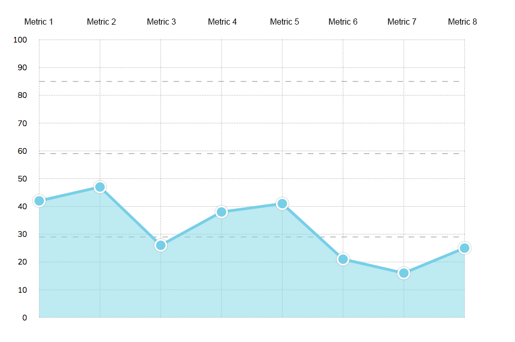
Recently I had the task of taking assessment data and drawing it on a graph so that it matched the design below:
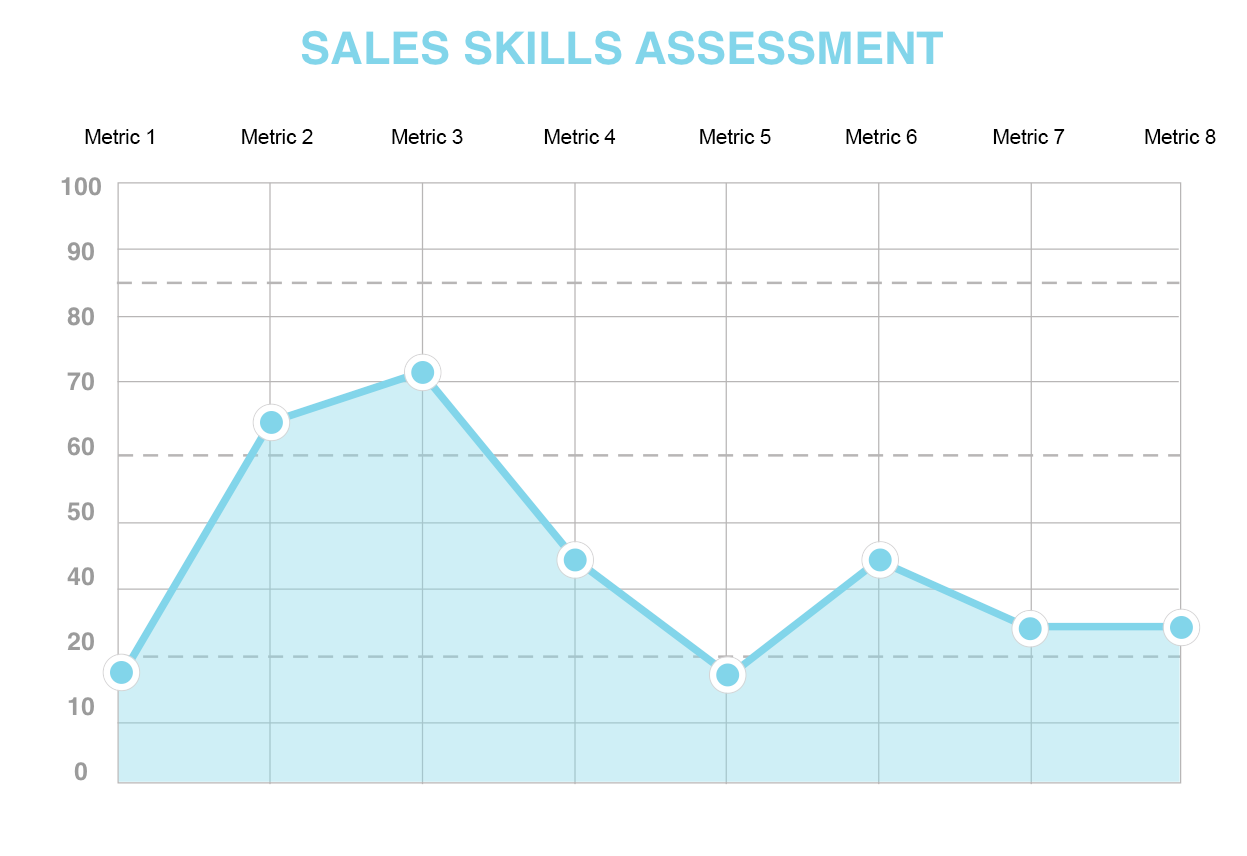
This graph is produced once a user has answered a bunch of questions via a website, and they get a new custom graph each time they do the test. The scoring had been set up, but the graph had not, so I had to research how best to generate it.
Option 1: D3 Library
 The D3 library is a beautiful place to spend an afternoon if you’re a data nerd like myself. It has a fantastic collection of dynamic graphs in many shapes, sizes and colours.
I’ve made a few graphs using these libraries in the past. However, as this project only needed a static graph (display only, no user interaction needed), building with javascript was probably a bit overkill.
Option 2: jQuery
 Another way this could be accomplished is by using front-end code (HTML, CSS and jQuery). There is a great tutorial on creating an animated front end graph, which I have found helpful on past projects.
This seemed like a good option. However, as the data was being generated with Ruby code, I felt that using Ruby to process it would be a better choice. Also, whenever possible, I prefer to write only non-essential code in JavaScript/jQuery as about 1-2% of users will have it turned off.
Option 3: SVG’s

An SVG is one of the types of images that can be displayed on your website. They are particularly useful as they can scale up and down without losing quality. They can also be created, and modified, with programs like photoshop, or even written inline in the code itself.
Because they come in so many different formats, they can be a bit complicated. I recently created one for a circle graph and so, even though that one was a lot simpler, I thought it might be a good place to start.

Let’s Try It: an Inline SVG with Embedded Ruby
Part 1: Following a Tutorial
After a quick search on Google, I found a tutorial with a similar-looking graph being drawn with SVG code. I decided to start there.
I followed the tutorial, adapted it for the brand colours, omitted the javascript library, added in one data line, and came up with the following:
It was a good start, though I still didn’t really know what I was doing, and a lot of my code looked like this:
</code></pre>
It seemed that I would have to learn a lot more about what was happening behind the scenes in order to get it to look like my graph.
## Part 2: Expanding the X and Y Axis
The first difference between this base graph and mine was the number of grid lines, so I started adding in more. To get it to fit on the page, I had to squeeze the lines together, which required a bit of manual maths to ensure it all lined up correctly.
When things didn't quite fit, I had to go back and recalculate every line again which was a bit of a pain. It did, however, teach me what all the numbers meant.
X grid lines (vertical lines)
</code></pre>

`y1` was the top of the graph and `y2` was the bottom. These are the same for every x grid line as they are all the same height.
`x1` and `x2` are how far from the left hand side the line will be drawn. If they are the same value it will be a straight line, if different it will be on a diagonal.
Y grid lines (horizontal lines)
</code></pre>
These were the same but reversed, `x1` was the left hand side and `x2` was the right hand side. These are the same for every y line as they are all the same length.
The `y1` and `y2` are how far down from the top the line should be drawn.
Now, about that manual calculation! To move the lines around, I had to go through every set of grid lines, data points and labels. This is where I moved it into erb tags so I could calculate it with Ruby code instead.
<% traits.each_with_index do |trait, index| %>
<% x_line = 113.0 + (index * 119.0) %>
<% end %>
<% scales.each_with_index do |scale, index| %>
<% y_line = Matenia Rossides.0 + (index * 55.0) %>
<% end %>
This way, it generates as many lines as there are traits and, if I need to update the spacing, it's very quick as I only have to update it in one spot.
(Note: The numbers here were then moved into variables, I kept it as is for this example so the progression could be seen more clearly)
## Part 3: Adding in the Real Data
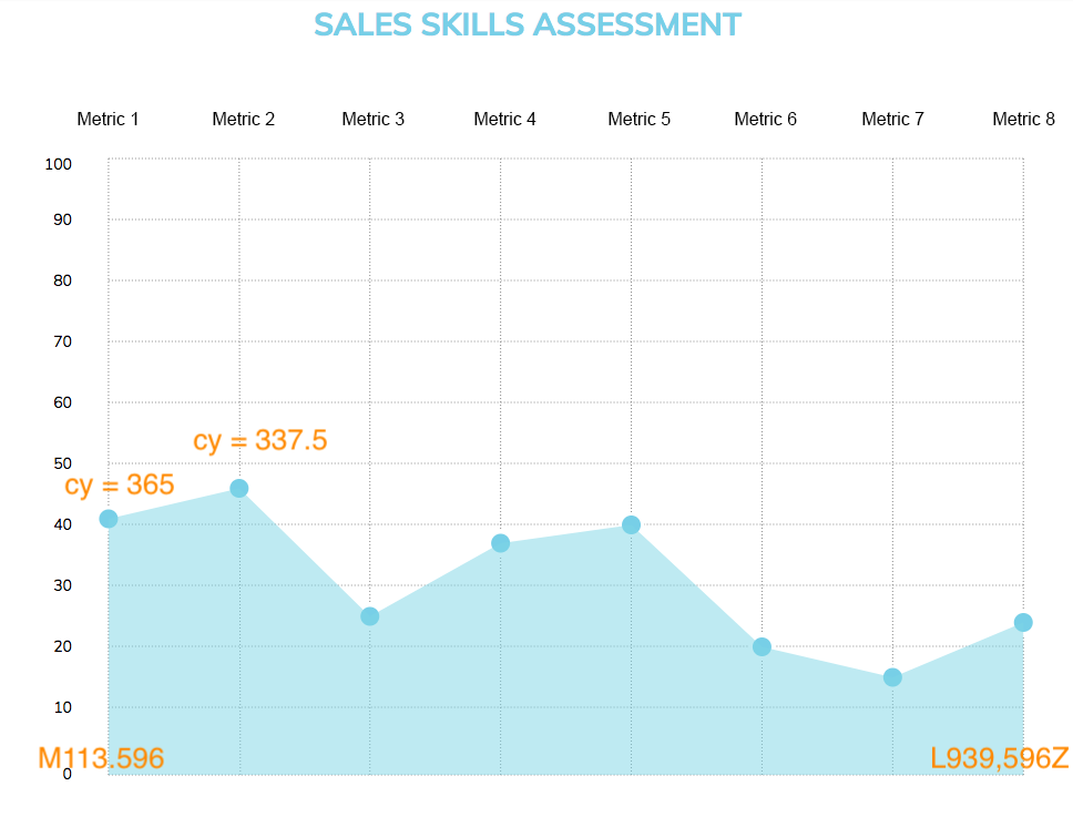
Now that I've got the grid lines drawing nicely, it's time to add in some real data points. There are two elements in play so far; the first being the data circles, the second being the area under the graph. (Later we'll add in a third data line connecting the dots). At the moment they are just drawn on randomly like so:
</code></pre>
With `cx` being the position on the x axis and `cy` being the position on the y axis like before. `data-value` should reflect the actual value when you read the graph, and `r` refers to the radius of the circle.
The blue area under the graph is then drawn with the following code:
</pre>
The `d` value starts with the position in the bottom left, then all the data points, then the position on the bottom right. When one data point gets changed or added, it needs to be updated here too. They also need to be positioned to reflect what score the person got on the test.
I then updated these to be calculated in a similar way to the grid lines above to get the following:
<% traits.each_with_index do |trait, index| %>
<% score =scores[trait] %>
<% xcord = 113.0 + (index * 119.0) %>
<% ycord = 596.0 - (score * 5.5) %>
<% end %>
</pre>
The x co-ordinate is calculated the same way as the x grid lines were previously.
The y co-ordinate is calculated by starting at the bottom (as this is the 0 value) and moving up to match their value. Each block is 55 points high (as shown before when doing the y grid) and it's on a scale from 0 to 100. So we then take the score, divide it by 100 and multiply it by 55 (equivalent to multiplying by 5.5). In this case the first score is 42, times 5.5 is 231. 596 minus 231 is 365.
The same calculation is then used in the path below the points.
I later added in a line connecting the dots which uses the same calculation inside the following element:
</code></pre>
## Part 4: Styling Touches
One of the strengths of using a programmable SVG inside your webpage is that you can [style it with CSS](http://www.opera.com/docs/specs/presto25/svg/cssproperties/) the same way you style anything else on your site. There are just a couple of different terms you may not have encountered before, but they do the same thing. For example the data point circles here are:
svg.graph .points {
stroke: white;
stroke-width: 3;
fill: #82D5EA;
z-index: 10;
}

Where `fill` is `background-color`, and `stroke` is `border`.
Unfortunately there is no box-shadow property for SVG, so that effect is done by having a second circle underneath.
svg.graph .points .shadow {
stroke: rgba(74,74,74,.2);
z-index: 5;
}
Styling the text labels is also done in a very similar - but slightly different - way.
Where `text-anchor` is `align-text` and they are positioned using x and y the same way as the other svg elements.
Understanding
</code></pre>
svg.graph .labels {
font-family: "Muli", sans-serif;
font-size: 14px;
color: #4A4A4A;
}
svg.graph .labels.x-labels {
text-anchor: middle;
}
A few extra grid lines were also added in to section off different parts of the graph, these are drawn using the `stroke-dasharray` property to make the lengths of the dashes, with the `stoke-width` referring to the height of the lines.
svg.graph .dotted-lines {
stroke: #979797;
stroke-dasharray: 1 2;
stroke-width: 1;
}
svg.graph .dashed-lines {
stroke-dasharray: 10 10;
}
## Final Product:
So putting it all together, with some values changed to variables in the end, I had made a graph using inline SVG code that accurately presented the users scores. With custom styling that matched the rest of the project and (relatively) easy-to-read code that could be modified quickly to update the axis or size of the graph.
## Part 5: Advanced - Moving the Inline Ruby to a Presenter Class
I hadn't made a presenter class before and wasn't quite sure what they were. Luckily, I had Ryan Bates on my project, who created Rails Casts. He pointed me to an episode on this topic called Presenters from Scratch, which I suggest you check it out. Presenters work kind of like a [Controller](http://rvlasveld.github.io/blog/2013/09/26/rails-presenters-filling-the-model-view-controller-gap/), but for view/client-side code. In this case, as the client is the person completing the test, it will be calculated each time.
This was done more as a learning exercise, as it didn't change the look or functionality of the graph. It did make it a bit easier to make changes, and the code was DRY'er as the data point function that I had in three places could be put into a single method. I also updated it to pull in labels from the database and dynamically draw the grid lines based on how many traits were there and the specified width and height.
This is a simplified example of how it was set up to work in my Rails project:
# presenters/graph_presenter.rb
class GraphPresenter
def initialize(view, traits)
@view = view
@traits = traits
end
def render
# Renders the results/_graph.html.erb partial, passing in this presenter as a `graph` variable
@view.render("results/graph", graph: self)
end
…
end
# How it was then generated through the show page
<%= GraphPresenter.new(self, @traits).render %>
I then moved the Ruby code from the view into the graph presenter. As an example, here is the code for generating the x grid lines:
# Graph Presenter
def horizontal_spacing
(right_border - left_border) / (traits.length - 1)
end
def xcord(value)
left_border + (value * horizontal_spacing)
end
def x_grid_lines
traits.each_with_index.map do |trait, index|
@view.tag.line x1: xcord(index),
x2: xcord(index),
y1: top_border,
y2: bottom_border
end.join.html_safe
end
# Then referenced in the graph partial
<%= graph.x_grid_lines %>
I moved all the inline Ruby into the Presenter class and put everything into method variables and calculations. This tidied up my graph partial html file, making it easier to read and consolidate the duplicate calculation code into single methods.
Before, for example, the code that calculated where the data points sat on the graph was used in three places. It is now split into reusable methods which find the x coordinate and the y coordinate for the data point.
def score_adj
vertical_spacing / 10.0
end
def score_cord(trait)
bottom_border - (score_value(trait) * score_adj)
end
def data_points
traits.each_with_index.map do |trait, index|
@view.tag.circle cx: xcord(index),
cy: score_cord(trait),
r: "10"
end.join.html_safe
end
# Summing Up
There were quite a few obstacles on this project as there wasn't a lot of references out there that handled this kind of problem. I found one [Ruby gem SVG builder](https://github.com/DannyBen/victor) which looked interesting as a starting point if you want to check it out.
SVG documentation is often difficult to follow as there are a few different types of SVG's and it's taken me longer than I'd like to admit to figure out what they all are.
Presenters too don't seem to be all that common, though I found them very useful in this case. I've attempted similar problems before using javascript and found it much, much, much easier using Ruby to tackle these calculations.
So there you have it: a Ruby Presenter class drawing up a custom SVG line graph. Hopefully you found it useful and will consider building something similar in the future.