![]()
Services:
UX/Design
Technology:
UX Services
Having been built and deployed to market rapidly, many of the UX and Design elements had taken a back seat and suffered as a result. As Flood.io features continued to grow, important UI elements increasingly felt homeless without sound structure or principle to their design.
"Ildikó transformed everything from static portions of our site, through to more dynamic, complex user experiences which were completely re-engineered from the ground up."
Tim Koopmans, Flood.io

Flood.io UX and Design
Flood.io, a self service load testing platform, had some major challenges common to many startups in the tech industry.
Having been built and deployed to market rapidly, many of the UX and Design elements had taken a back seat and suffered as a result. As Flood.io features continued to grow, important UI elements increasingly felt homeless without sound structure or principle to their design.
Tim Koopmans from Flood.io engaged the services of reinteractive to completely overhaul the user experience and design of the site, in Tim’s words “taking it from zero to hero in just a few short weeks.”
User Experience and Design
To begin with, reinteractive’s UX Consultant researched the available data about the service and observed Tim’s actions as he engaged with Flood.io. The software was then tested by our team so that we could see potential problems, identify areas of concern and come up with user friendly solutions to help improve the design of the platform.
Once both Tim and our team had a better understanding of the key issues, a report of these issues was put together and used for reinteractive’s UX consultant to work off. We then recommended changes to the flow, pages and look of the web site by putting together a clickable and testable prototype.
Next, reinteractive’s designer worked on the visual design and collaborated closely with our UX consultant to achieve an outcome that conveyed the user information in a simple and concise manner, while forming a strong and memorable identity for the brand. Clean presentation of information and an easy to use interface was key for the internal user pages.
"Having built and deployed Flood.io to market rapidly, many of the UX and Design elements had taken a back seat and suffered as a result.
As Flood.io features continued to grow, important UI elements increasingly felt homeless without sound structure or principle to their design."
Tim Koopmans Flood.io
Changes to the workflow
The Home Page
The first concern we had was on Flood.io’s homepage. With no pricing plans or explanation, it appeared unclear to the user what they would be signing up for via the ‘sign up now’ button.
First we changed the ‘sign up’ button to a ‘register now’ button. This was renamed to avoid confusion between ‘sign up’ for new users and ‘sign in’ for returning users. Once clicked, a lightweight modal popup screen asks users for necessary register information and lets the user know that they can try this for free.
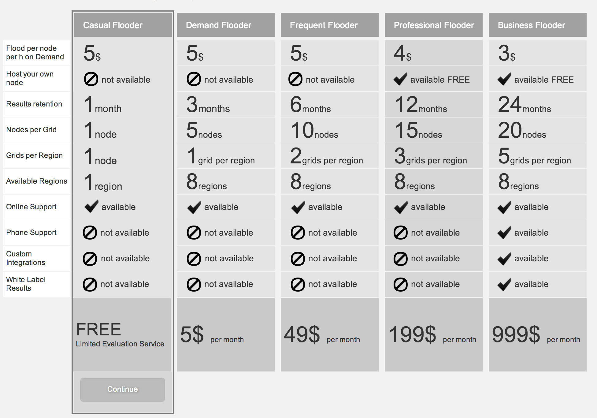
Pricing Plans
In the previous version of Flood.io the pricing plan was not prominently displayed. It was only shown in the footer or once logged-in, via the user’s account settings. Even when a user was able to reach the payment plan page, it was not interactive or clickable. This left registered users uncertain as to how to upgrade their account to a paid subscription and receive additional features. While a plan could be updated by the user via the ‘Payment Method’ form in their account settings, this was often overlooked.
Our team updated the pricing plan to make it more obvious to users so that they could easily see what they were getting and to emphasise the difference between each package offered. We achieved this in two ways; first, we included the pricing plan as part of the signup process. Once a user is registered, they are taken directly to the pricing plan page. This page is now clickable and the user is able to use this to choose their plan. This also lets the user know exactly what they are getting and what is available before signing up. Second, we made it easy to upgrade at anytime by displaying the user’s current plan and the option to upgrade on their page header at all times.
"reinteractive’s UX Designer was able to quickly digest the data that Flood.io provides and turn that into meaningful information for our users.
“Nothing was sacred. She transformed everything from static portions of our site, through to more dynamic, complex user experiences which were completely re-engineered from the ground up. This brought much needed consistency to the design and has helped with ever important customer conversions.
“The blueprint that has been developed leaves me with confidence to expand with new features, that will respect many of the lessons learned during wireframing and prototyping.”
Tim Koopmans Flood.io
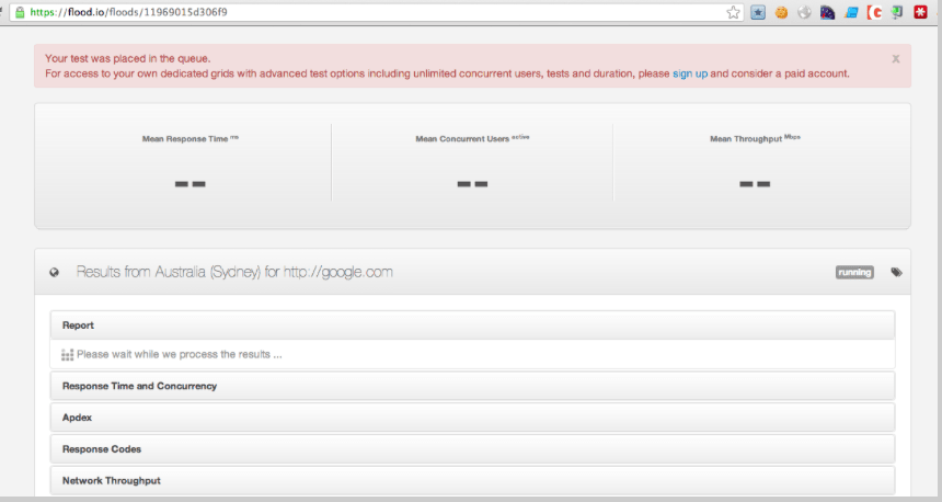
Flash Floods
Flash flood is a “demo” version of the Flood.io service, giving the user the ability to test the service without registering an account. Previously, the user tested this service by typing their URL into a text box and was waiting, with no instructions of what would happen once complete.
Our team added text to let the user know that it will take about 30 seconds for the ‘flash flood test’ to run once they have added their URL and clicked on ‘run free flood’. This helped manage the user’s expectations, making them aware of what is going to happen next.
In the past, once the user had entered a test URL they were taken to the ‘Flash flood’ results page. This page’s header had a red message box that let the user know that their test was in the queue. We were concerned that the design of this message box could easily be confused by the user as an error message.
We replaced the red message box with a welcome message, clearly letting the user know what was happening and what they should do next.
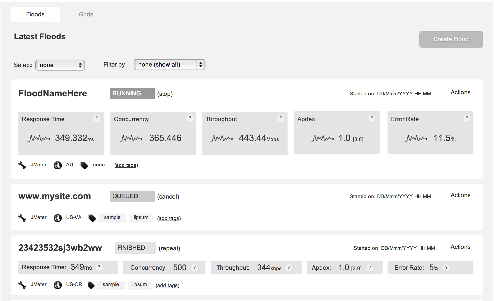
Floods List
Once the user had logged into their Flood.io account, they were presented with a table of ‘floods’ that they had previously run. This page was extremely important to the user, as it held all of the user’s content and data.
Making this page user friendly was one of the key tasks of our UX redesign effort. We rearranged the ‘flood index’ test results, prioritised the tests and illustrated the statistics to the user with sparklines. In addition to this, the user is now able to see their live flood test results adjusting in real time. We also implemented options to filter the data so the user can change the way their results are displayed on the page.
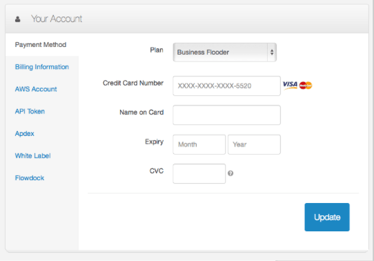
Account Settings
The Flood.io user account settings had previously been multiple forms across different pages in which the user had to input their details.
Our team simplified this by creating a single page that displays the user’s details and pricing plan. The user is now easily able to see what is included in their plan and has the option to easily upgrade.
It had also been clear to Tim that most users were creating a ‘flood’ by uploading a test plan rather than using an actual URL. So, we also simplified this into a single form that automatically detects your test plan type and is set to ‘upload test plan’ by default.
Implementation and Design
The design did not stop at a single screen. Once our team had created a clickable prototype with the workflow changes, these were implemented by our team’s designer. Everything from the logo through to the colour scheme and branding were all completely redesigned. This ensured that consistency flowed through the site, end-to-end, for a great user experience.
Our designer based the central design aesthetic around the concept of a ‘flood’ of users - this carried through to the logo (which combined the visuals of a wave and a statistics graph) through to the choice of blue as the dominant branding colour.
Although redesigned, the Flood.io pages still presented a mountain of information to the user. The challenge for us was to present this information in a way that wasn’t confusing to the user and maintained a sense of visual harmony by not feeling too busy or crowded. Our designer achieved this, in part, by using a simple, white palette with selective use of colour to draw attention to various elements of the interface.
Tim welcomed the improvements and was excited by the changes our team had made. He shared his experience of working with our team.
"I was really impressed by reinteractive’s Front-End Developer's faithful interpretation of the UX wireframes into really stunning front end design. She was the brains behind the look and feel of Flood.io, including the logo, colour and branding."
Tim Koopmans, Flood.io
Book a free consultation with a reinteractive expert