In user experience (UX) design, getting caught up in the grand schemes of information architecture, visual design, and user flows is easy. However, it's often the most minor, subtle interactions that significantly impact user satisfaction and product adoption. These seemingly insignificant details can make or break a user's experience, turning a potential frustration into a delightful moment.
The Power of Micro Interactions
Micro Interactions are the small, focused interactions between a user and a digital product. They can be as simple as a button click, a dropdown menu, or a loading animation. While these interactions may seem trivial, they are crucial in shaping the overall user experience.
Why Small Interactions Matter
Building Trust and Credibility
- Consistent Feedback: A well-designed loading animation or progress bar can reassure users that their action is being processed, building trust and credibility.
- Clear Error Messages: Informative and helpful error messages can prevent user frustration and guide them towards a solution.
Enhancing User Satisfaction
- Delightful Animations: Subtle animations can make mundane tasks more enjoyable, such as a playful character appearing when a user completes a task.
- Intuitive Microcopy: Clear and concise microcopy can guide users through the interface without overwhelming them.
Improving User Efficiency
- Quick and Responsive Interactions: Fast load times and snappy animations can significantly improve user efficiency.
- Predictable Behaviors: Consistent interactions across different product parts can reduce user cognitive load and speed up task completion.
Real-world examples of Effective Micro Interactions
Google's "Magic Wand" Cursor - Google's search bar features a small, animated "magic wand" cursor that appears when a user starts typing. This simple animation adds a touch of whimsy and reinforces the idea of instant results.
Apple's Haptic Feedback - Apple devices use haptic feedback to provide tactile confirmation of user actions. This subtle vibration adds a layer of physical sensation to digital interactions, making them more satisfying.
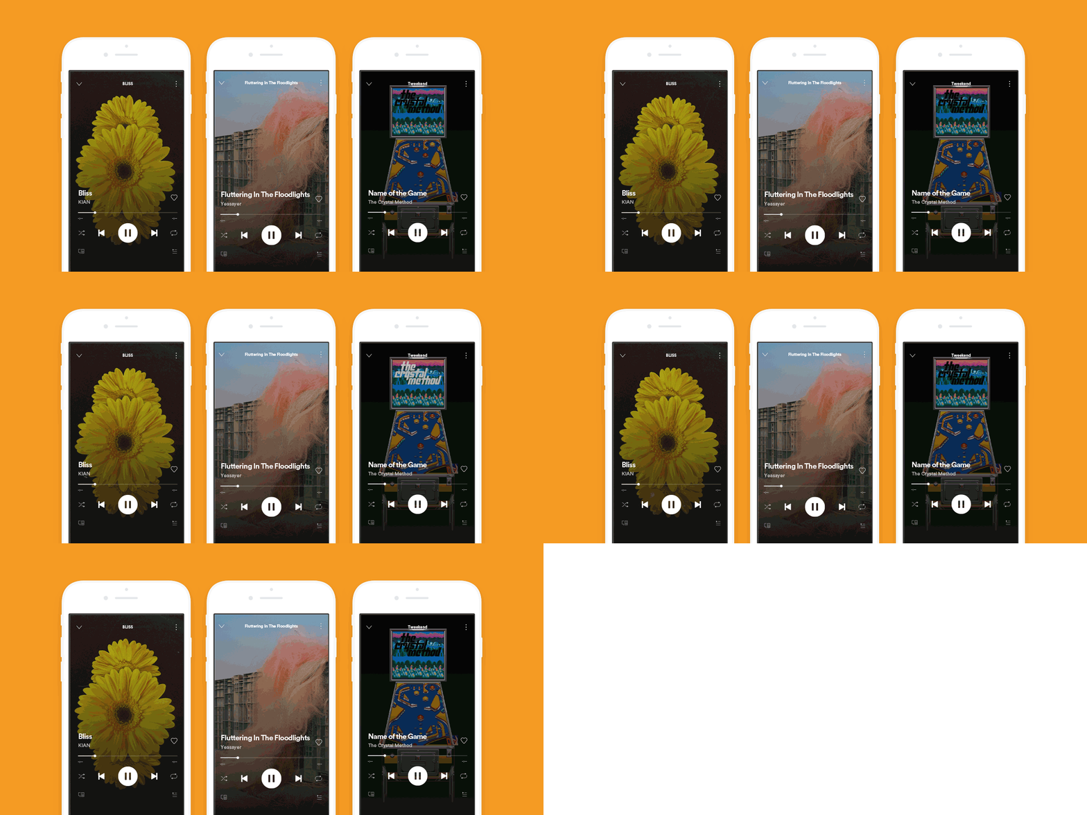
Enhancing User Satisfaction - Spotify's Canvas feature uses short, looping videos to accompany songs. This visually appealing micro interaction enhances the music-listening experience and creates a more immersive environment.

Airbnb's Animated Loading Icons - Airbnb uses custom loading icons that mimic real-world objects, such as a plane taking off or a car driving. These visually appealing animations provide a sense of progress, making the wait time more enjoyable.
Button Hierarchy
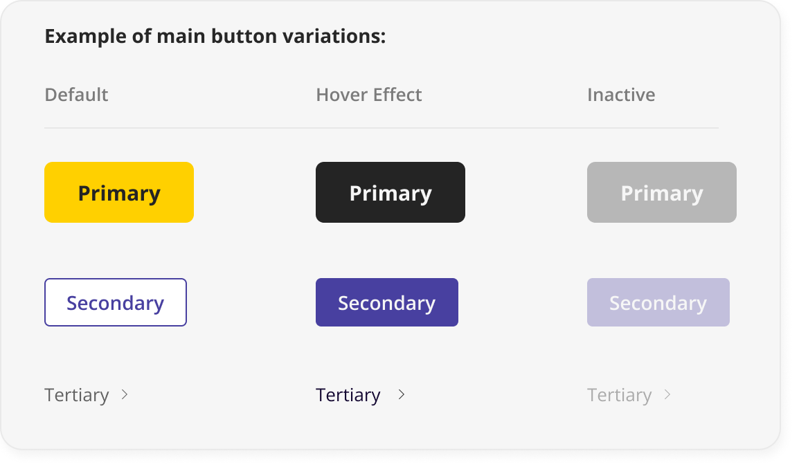
Understanding and utilising button hierarchy is a fundamental but often overlooked aspect of effective UX design. This hierarchy categorises buttons into three primary types: primary, secondary, and tertiary.

- Primary Buttons: These are the most important buttons on a page, typically used for the primary action. They should be visually prominent, with clear and concise labels.
Example: A large, brightly coloured "Buy Now" button on an e-commerce product page.
- Secondary Buttons: These buttons are less critical than primary but still significant. They often serve as supporting actions or alternative options.
Example: A smaller, less prominent "Add to Cart" button next to the primary "Buy Now" button.
- Tertiary Buttons: These buttons are the least important of the three and are often used for minor actions or additional information.
Example: A small, lightly coloured "Learn More" button that opens a modal or tooltip.
Hover Effects and Color Changes
Designers often incorporate hover effects and colour changes into button design to enhance the user experience and provide visual feedback.
- Primary Button Hover: When a user hovers over a primary button, the button's colour can slightly darken or lighten, or a subtle animation can be triggered.
- Secondary Button Hover: The hover effect for secondary buttons is typically less pronounced than for primary buttons. A slight colour change or a subtle border animation can be used.
- Tertiary Button Hover: Tertiary buttons may not require a hover effect, as they are often less prominent. However, a subtle colour change or a slight increase in opacity can indicate interactivity.
By effectively utilising button hierarchy and incorporating thoughtful hover effects and colour changes, designers can create intuitive and visually appealing user interfaces that guide users seamlessly through the digital experience.
Key Principles for Designing Effective Micro Interactions
- Purposeful Design: Every micro interaction should have a clear purpose and contribute to the overall user experience.
- Consistency: Maintain consistency in design elements, animations, and behaviours across the product.
- Delightful Details: Add small touches of personality and surprise to make interactions more memorable.
- User Testing: Test micro-interactions with real users to identify issues and refine the design.
By paying attention to minor details, UX designers can create functional and delightful products. Understanding micro interaction’s power allows us to create pleasant user experiences, resulting in higher engagement times.
Ps. if you have any questions
Ask here